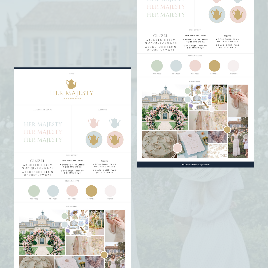
Her Majesty Tea Company
Project: Brand and Web Design
Client: Her Majesty Tea Company
Deliverables:
Primary logo
Alternative logo
Submark
Website
Tea bags
Packaging
Design Objective: The design objective for Her Majesty Tea Company was to craft a visually captivating and regally elegant branding and web design that draws inspiration from the charm of Bridgerton and British elegance. The colors pastel blue, pink, green, and gold were utilised to evoke a sense of sophistication and refinement. I combined elements of Georgian-era elegance, opulence, and romanticism. This was reflected in the choice of typography, ornate flourishes, and visual motifs that evoke the period's grandeur.


